Blog Layout
Welcome to the New Riverlands Dental Website
Faris Kirmani • June 26, 2019
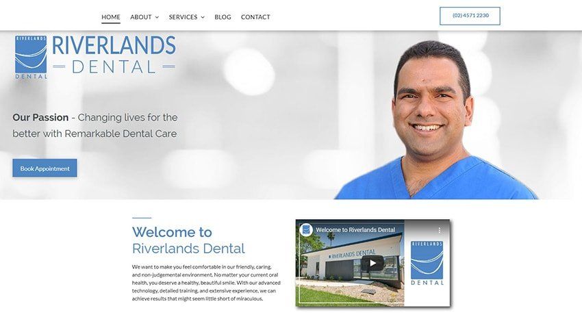
While our main passion is dentistry, let us take a moment to share how proud and excited we are about our new website. While we’ve long had a website at https://www.riverlandsdental.com.au, the new website offers many great features. The site is beautiful, with a crisp, clean design that’s laid out in our relaxing Riverlands Dental blue with lighter blue and grey accents on a white background that makes the text easy to read.
First, we’ve got a new, improved home page. This page introduces you to our dentists, our facility, and explains some of the procedures we emphasize here at Riverlands Dental.
Of course, a more complete services page
is also one of the great features of our new website. With a clean, open layout, this page offers a brief introduction to all the procedures we commonly offer at Riverlands Dental. If you need more information about any procedure, you can get it by simply clicking on the name of the procedure or the icon above it, and you’ll be taken to a full page of detailed information.
Detailed Content
The detailed pages of content are another of the new features of our website. Each page is laid out in a straightforward fashion. First, there’s a brief summary of the procedure. It’s a little longer than the one on the services page, and it lays out all the most important details you need to know. It’s an easy way for you to make sure you’re on the right page, and it provides quick answers for people who find our website via Google or another search.
Then the page focuses on important information that’s relevant to you, like symptoms of a condition, situations where a procedure might help, or benefits of that procedure. We’ve also highlighted a couple of the most common questions we get about a procedure and set them aside in an interactive format so you can easily see them and get the answers you’re looking for. As you read down the page, expect the information to get a little more technical and detailed, even esoteric sometimes. We know most people don’t read the entire page, so we put info down here that fewer people are interested in, or you might rather hear it directly from us. But clear headings also make it easy to scroll & scan the pages to find what you’re looking for.
Easy Contact Info
Speaking of scrolling, one of the great features of our new website is that it makes it easy for you to contact us from anywhere on the site. As you scroll up and down the pages, the phone number stays with you, letting you call us with just one click.
Or you can access the contact page from anywhere, too. There you’ll find our address, a contact form, our hours, and a responsive map that lets you get directions right from our site without opening a new tab. The hours and map are also at the bottom of every page, so you can just scroll down to find out if we’re open and get directions if you need them.
Fully Responsive Site
Another great feature of our new site is that it’s fully responsive. It reads where you’re browsing from and adjusts immediately to scale to your device. This lets you switch easily from a phone query to your tablet, laptop, or desktop when you get home, or vice versa. It’s so responsive, it can even work on the largest TV you have if you want to cast it there for some reason. All the functionality of the site remains no matter where you’re looking at it.
Stay Awhile and Browse
And, of course, the new site includes a blog, which we know you know about because . . . here you are! We’ll use our blog to update you about different topics that are relevant to our practice or new information about dental procedures that come up. You can visit our site regularly and find that there’s always something new.
We’re happy with the new design and features of our website, and hope you are, too. Take some time to look around and see what you think. We’d love to hear about it at your next appointment.
Speaking of which, you can set up your new appointment easily with a phone call to (02) 4501 7930.
Suburbs Served
North Richmond


